Appearance
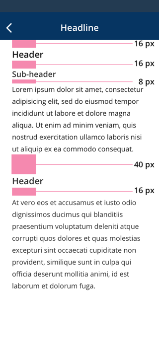
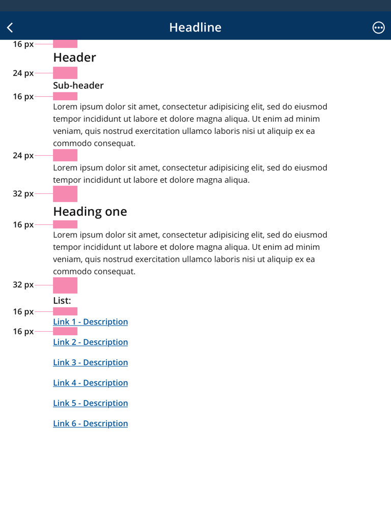
Typography Spacing
Meaning and Message
Typography Spacing is the vertical spacing between typography elements such as headers, sub-headers, paragraphs, and lists.
Typography Spacing - Mobile
Typography Spacing - Tablet & Desktop
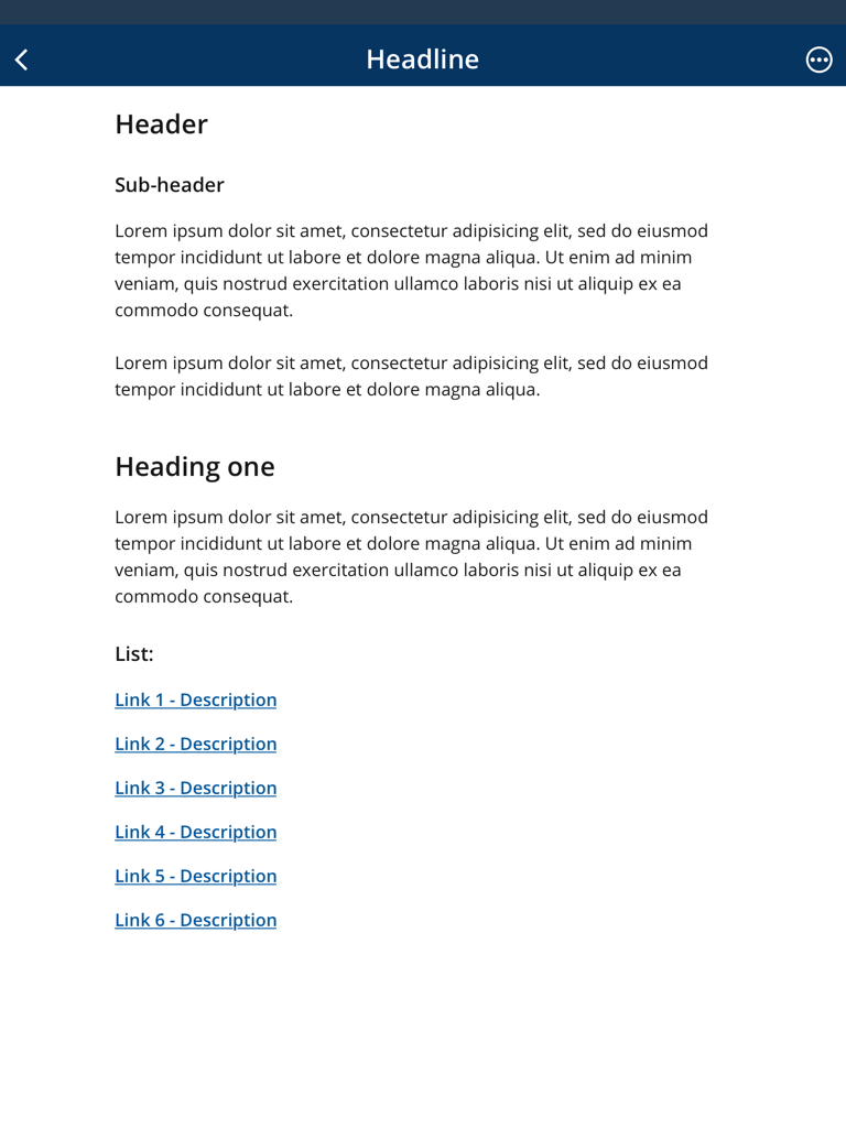
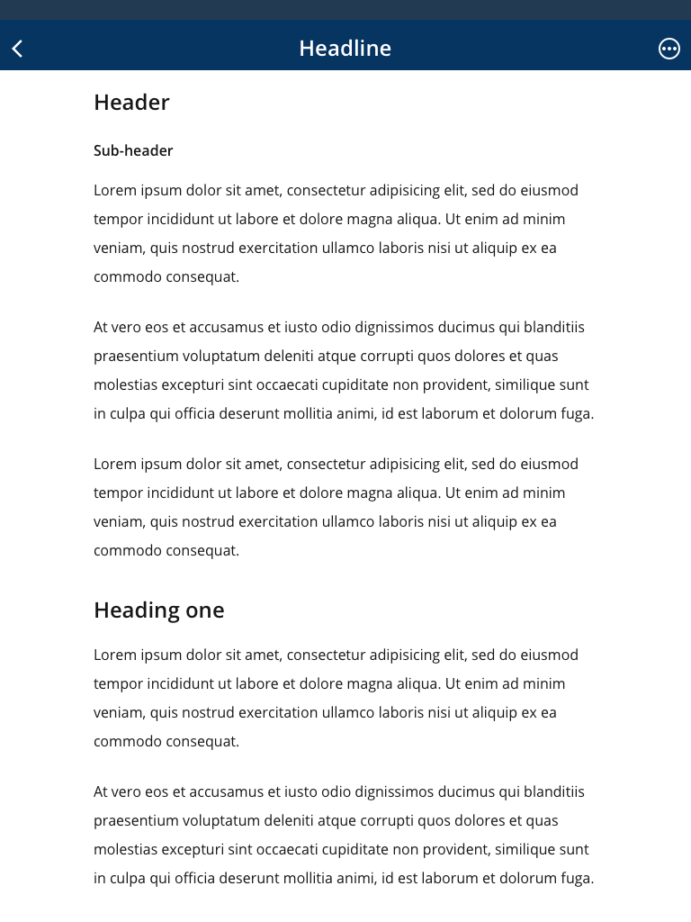
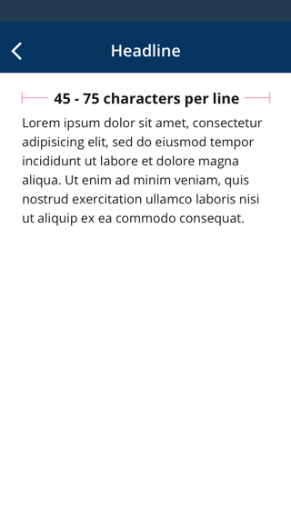
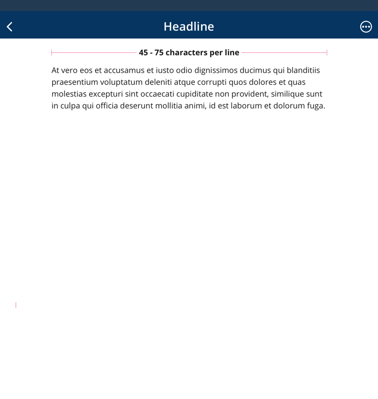
When using a large amount of copy (e.g., multiple paragraphs), it is important to increase the line height of the body text to have smooth readability and scanability. In the examples below, the first image displays a line-height of 24px, which is too tight; it proves the need to increase the line-height from 24px to 32px when having two or more long paragraphs. The image on the second image below shows the text at 32px line-height. This clearly demonstrates how much the extra line-height positively affects the legibility of all the text displayed.
For reference, see images below:
Body 1 Line Height: 24 px
Body 1 Line Height: 32 px
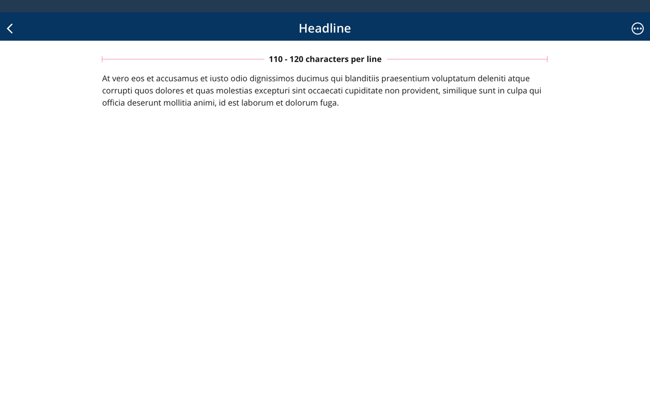
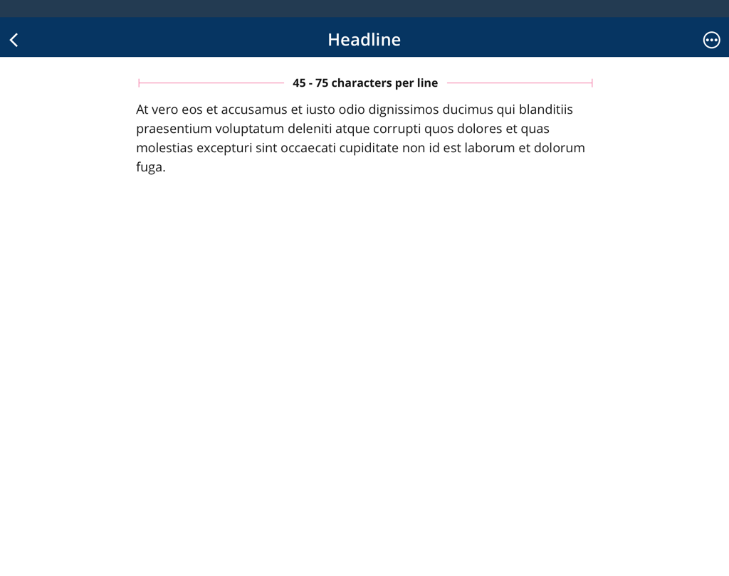
Line Length
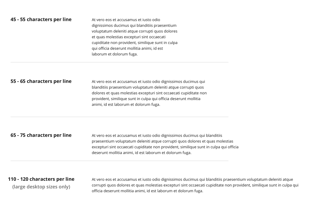
When styling paragraphs, it’s easy to make the mistake of fitting the text to your layout instead of trying to create the best reading experience. Usually this means lines that are too long, making text harder to read.
For the best reading experience, make your paragraphs wide enough to fit between 45 and 120 characters per line. The easiest way to do this on the web is using em units, which are relative to the current font size. A width of 20-35em will get you in the right ballpark.
Mobile
Tablet
Desktop 1080px
Desktop 1280px or Wider