Appearance
Focus Indicators
Meaning and Message
By defining a specific style for our focus indicators, we will create a smooth experience and maintain excellent compliance standards across all Primerica digital products. This page will cover the focus indicators used for links, buttons and inputs within the OneX design system.
Recommended Style and Color
Style recommendation for all focus indicators is a 2 pixel outline, with a 2 pixel spacing offset. Focus color of the outline will either be the link color, for text links, or Blue 600 in our design system, depending on what component is being focused. See individual components for more details.
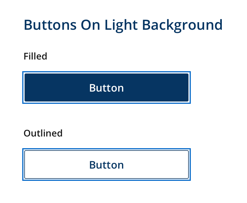
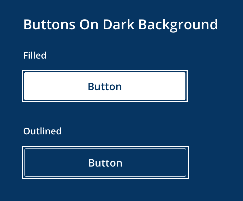
Buttons
Buttons' focus color will be Blue 600 for the outline on light background and White for the outline on dark background.
Icon Links
Icon links' focus color will be Blue 600 for the outline on light background and White for the outline on dark background.
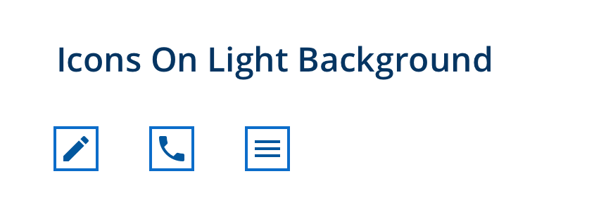
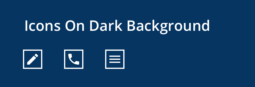
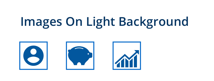
Image Links
Image links' focus color will be Blue 600 for the outline on light background and White for the outline on dark background.

Text Links
Text links' focus color will be the current link color for the outline.
Standard Link Color

Other Link Color

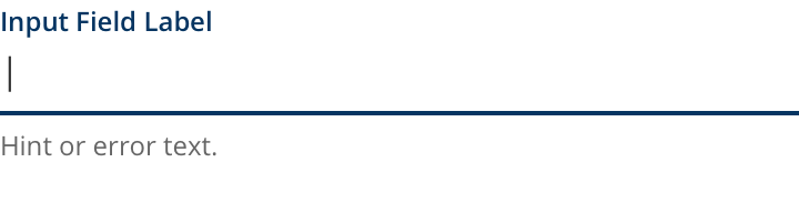
Input Fields
Input fields will use active state styles as their focus indicator. This includes color, shape and animation styles that are applied when entering information into this field.
Radios, Checkboxes and Toggles
Radio inputs, checkboxes and toggles will use active state styles as their focus indicator. This includes color, shape and animation styles that are applied when hovering this element.