Appearance
Spacing
Meaning and Message
Consistent spacing adds visual harmony and clarity to the UI and the user experience. Spacing should follow the Inter-component and Intra-component guidelines stated below to ensure predictable amounts of white space between and within components on a page.
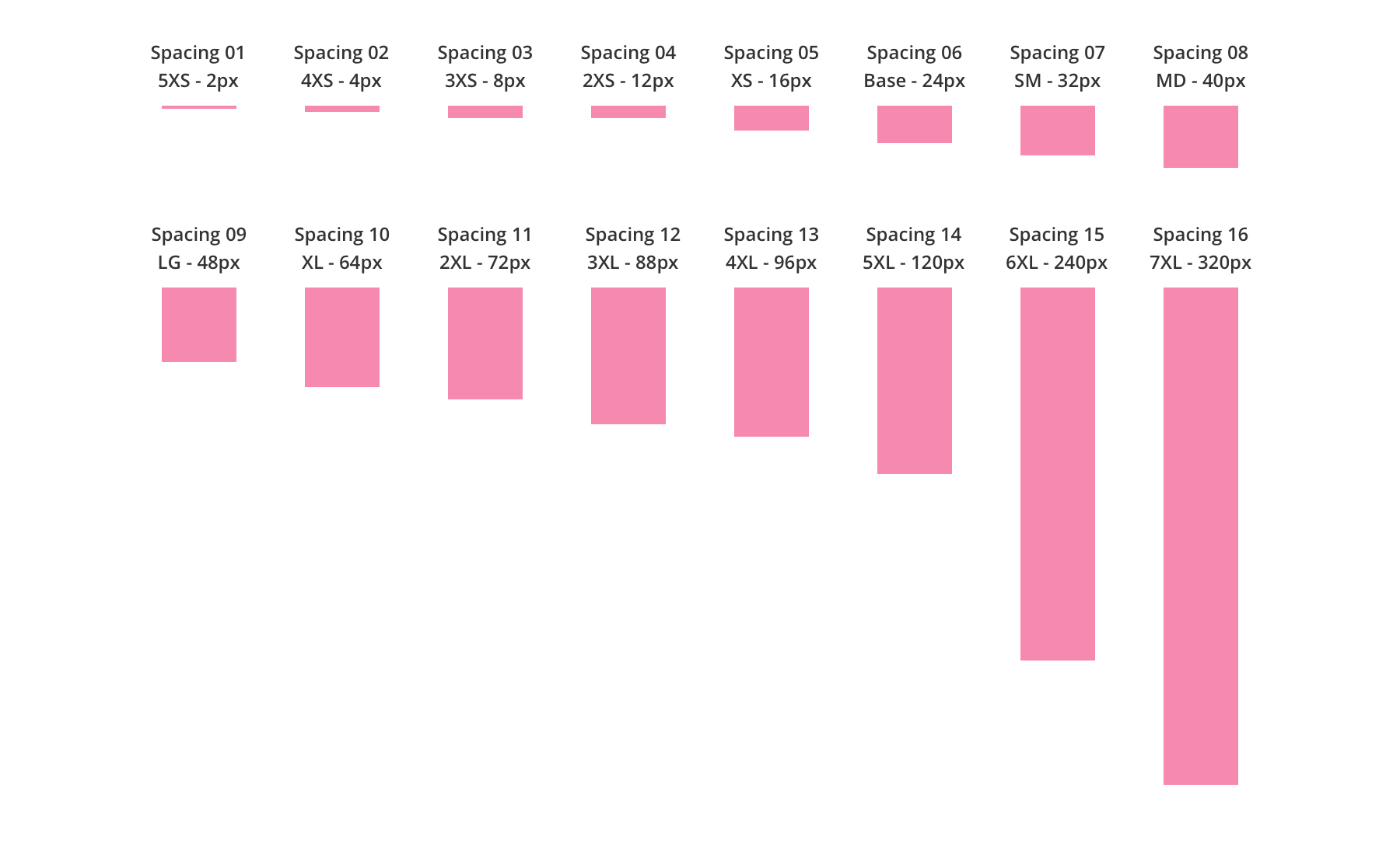
Spacing UI Units
For spacing units please refer to the following increments: 2px, 4px, 8px, 12px, 16px, 24px, 32px, 40px, 48px, 64px, 72px, 88px, 96px, 120px, 240px, 320px.
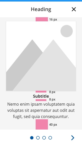
Inter-Component Spacing
Inter-Component spacing is the spacing between elements in a layout. This spacing contains larger units because it addresses the spacing between components in the entire document. (E.g., Between a title and a paragraph.)
Inter-Component spacing uses a larger scale because it covers spacing on a whole page vs. the spacing of elements within an individual component.
Inter-Component Spacing UI Units
Inter-Component spacing uses increments of 2px, 4px, 8px, 12px, 16px, 24px, 32px, 40px, 48px, 64px, 72px, 88px, 96px, 120px, 240px, 320px
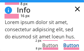
Intra-Component Spacing
Intra-Component spacing is the spacing between elements within a component. This spacing uses smaller units because it addresses the spacing within each component in the entire document (Example: Between a label and a radio button).
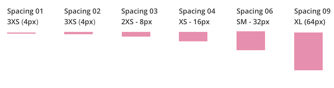
Intra-Component Spacing UI Units
Intra-Component Spacing uses increments of 2px, 4px, 8px, 12px, 16px, 32px, 64 px.
Intra-Component Spacing Applied on a Modal