Appearance
Motion
Meaning and Message
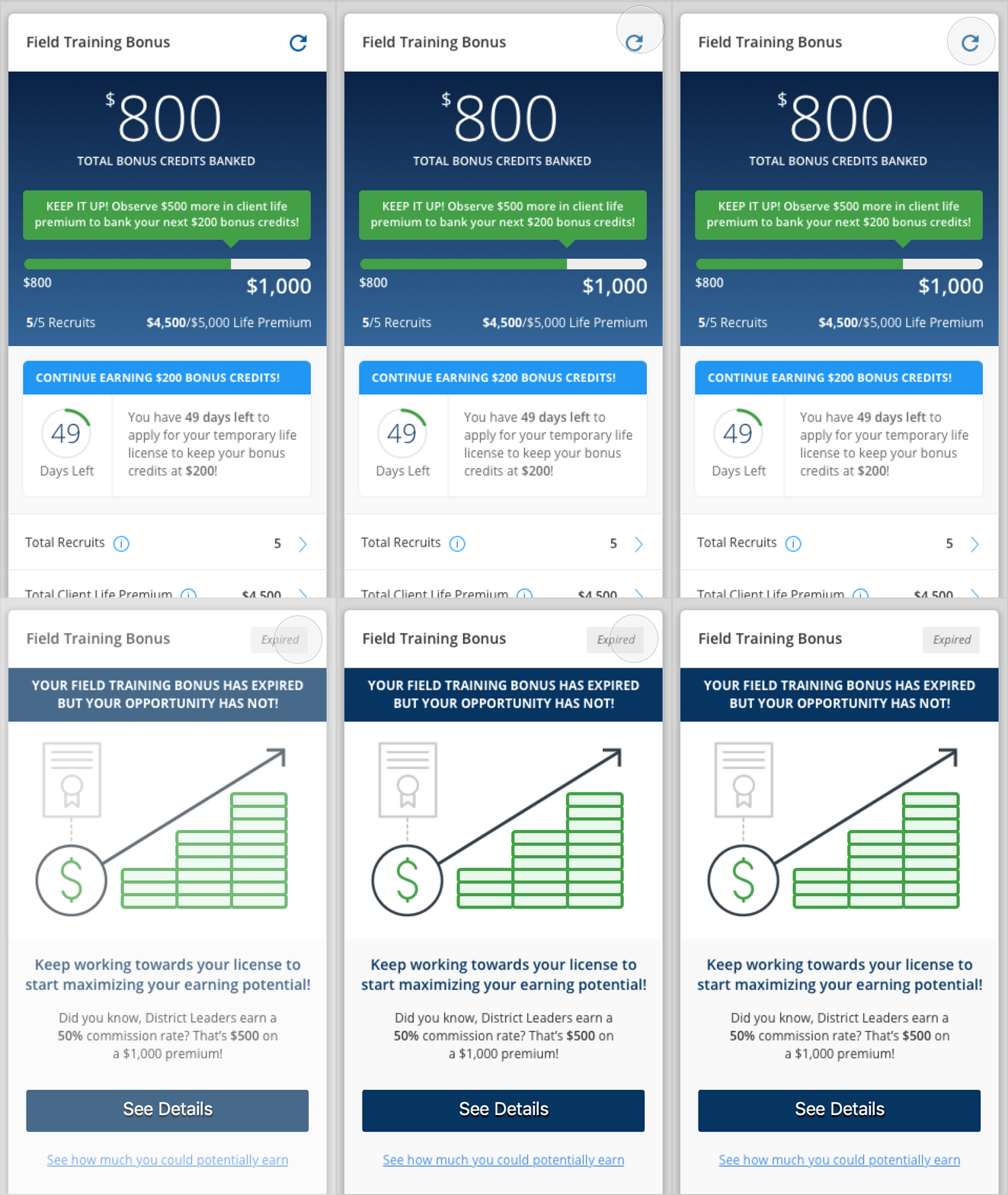
Motion provides immediate visual cues about changing UI states components.
Principles
Responsive
Animations should be a visual representation of feedback resulting from a user action and should highlight relationships between UI elements.
Brief
As a general rule, the duration of the entire animation should be between 100 ms – 500 ms, depending on the size and complexity of the interaction. Large and complex interactions should take longer while smaller changes like checkboxes or button state changes should be closer to 100 ms.
Motion and Animation Guidelines
- When creating motion or animation for any Primerica product, please refer to Material Design for guidelines, principles and best practices.
- Custom Animations on Illustrations should be simple. Since Illustration take time to be interpreted by the users, the animation style used should be subtle (X, Y position, rotation, scaling and opacity).
- Custom animations on icons, symbols, and simple vector elements could have more freedom of motion (X, Y, Z position, rotation, and scaling, masking elements, etc.). These elements have simple shapes, which makes the users interpret them easier and faster.
- Before creating complex, customize animations, please get the appropriate feedback with devs to estimate effort, scope, and ability to develop it.
Brand Expression
A brand’s personality and style can be expressed through motion. Motion is used to express a brand’s personality and style. Subtle animation in icons, illustrations, and product logos can add polish and playfulness to the user experience. Motion can be used to emphasize key points in a user journey.
![]()
Transition Types
OneX’s design system is comprised of four motion styles for transitioning between components or full-screen views. These transitions are designed to help users navigate and understand an app by reinforcing relationships between UI elements.
The transition types are:
- Container transform
- Shared axis
- Fade through
- Fade
Container Transform
The container transform is designed for transitions between UI elements that include a container. This transition type creates a visible connection between two UI elements.
By seamlessly transforming one element into another, the relationship of the two elements is reinforced. For example, when a card transforms into a detail page, the user's focus is directed to identify that the detail page is an expanded version of the card.

Shared Axis
The shared axis is used for transitions between UI elements that have a spatial or navigational relationship. This transition uses a shared transformation on the x, y, or z axis to reinforce the relationship between elements.
For example, when tapping next in an onboarding flow, both the outgoing and incoming elements transform horizontally in unison. By moving in the same direction, elements are perceived to be related to each other.

Fade Through
Fade through may be used for transitions between UI elements that do not have a strong relationship to each other.
For example, transitions triggered by tapping a bottom navigation bar use the fade through pattern. The fade through is the best choice because destinations in the bottom navigation are often grouped into major tasks that may not relate to one another. Additionally, the fade through pattern does not mislead users to think they can swipe horizontally between destinations.

Fade
A fade may be used for UI elements that enter or exit within the bounds of the screen, such as a dialog that fades in and out of view from the center of a screen.

Source: Google Material Design
Material Design Motion Resources
Material Design 2
Understanding Motion: Motion principles
The Motion System: Motion system
Speed: Motion speed
Choreography: Motion choreopgraphy
Customization: Motion customization
Material Design 3
Motion Overview: Motion overview
Easing and duration: Motion easing and duration
Transitions: Motion easing and duration

