Appearance
Interaction
Meaning and Message
When applied correctly, interactions with the use of gestures and states can provide users with the feedback they need to help them move through an application or web experience.
Interaction Guidelines
- When creating motion or animation for any Primerica product, please refer to Material Design for guidelines, principles and best practices.
- Use framework interactions that resemble current design system standards. Avoid inconsistent framework interactions.
Gestures
Gestures help users to navigate in app, move content, and manipulate UI elements with touch.
Other Inputs
Users navigate, move content, and manipulate UI elements with a mouse or keyboard on a desktop.
Interaction Principles
Effortless
Interaction principles help users perform tasks rapidly and intuitively using touch or mouse clicks.
Ease of Use
Users should be able to intuitively and imprecisely manipulate elements.
Types of interactions include:
- Tap
- Scroll
- Swipe
- Drag
- Click
Tap and Click
Users can navigate to destinations by touching or clicking elements.

Scroll
Users can slide surfaces vertically or horizontally to move continuously through content.
Swipe
Users can move surfaces horizontally to navigate between peers, like tabs.
Drag
Users can slide surfaces to bring them into and out of view.

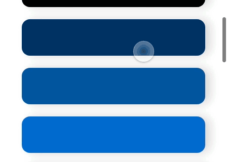
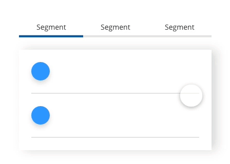
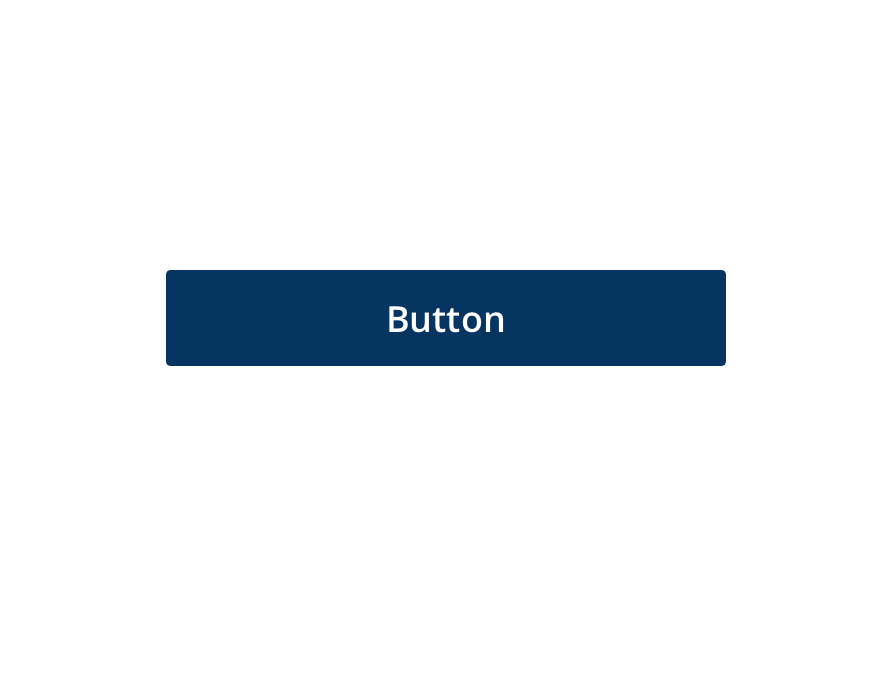
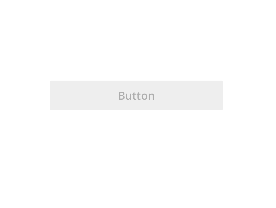
States
States are visual representations used to communicate the status of a component or interactive element.
State Principles
Each state should be visually similar and not drastically alter a component, but must have clear affordances that distinguish it from other states and the surrounding layout.
Distinct
States must have clear affordances distinguishing them from other states. States should be intuitively obvious to the user to match schemas. For example, disabled should be less visible or be grayed out. Hover state should have a shadow to indicate the component is floating or in focus.
Additive
When multiple states occur at once such as selection and hover, both state indicators should be displayed. States should never be directly conflicting (error and success states in one element)
Consistent
States should be applied consistently across components in order to increase usability.
Types of States include:
- Enabled
- Disabled
- Hover
- Focused
- Selected
- Validation
- Error
- On
- Off
Enabled
An enabled state communicates an interactive component or element.
Disabled
A disabled state communicates a noninteractive component or element.
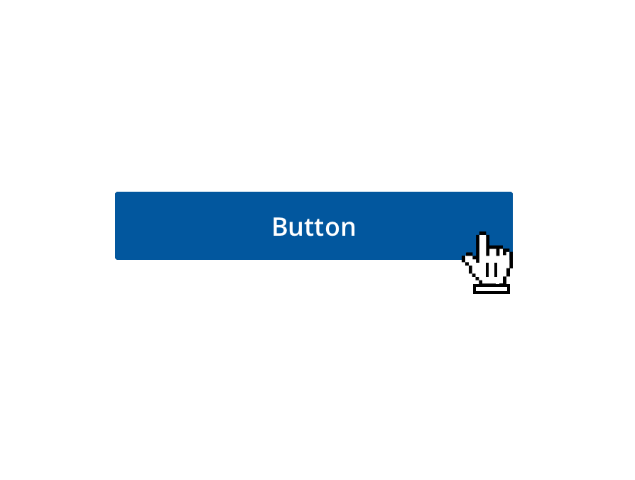
Hover
A hover state communicates when a user has placed a cursor above an interactive element.
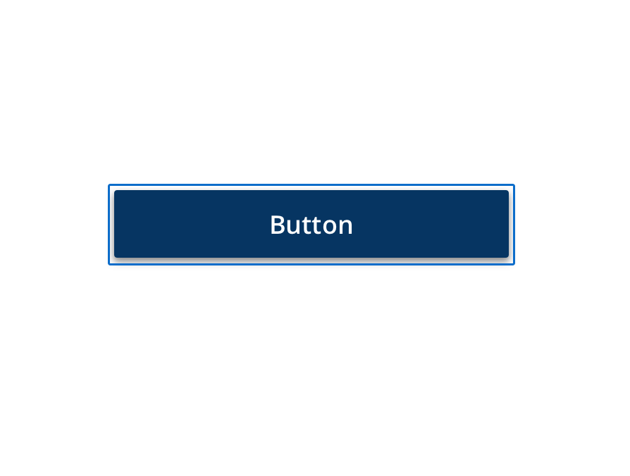
Focused
A focused state shows when a user highlights an element, using an input method such as a keyboard.
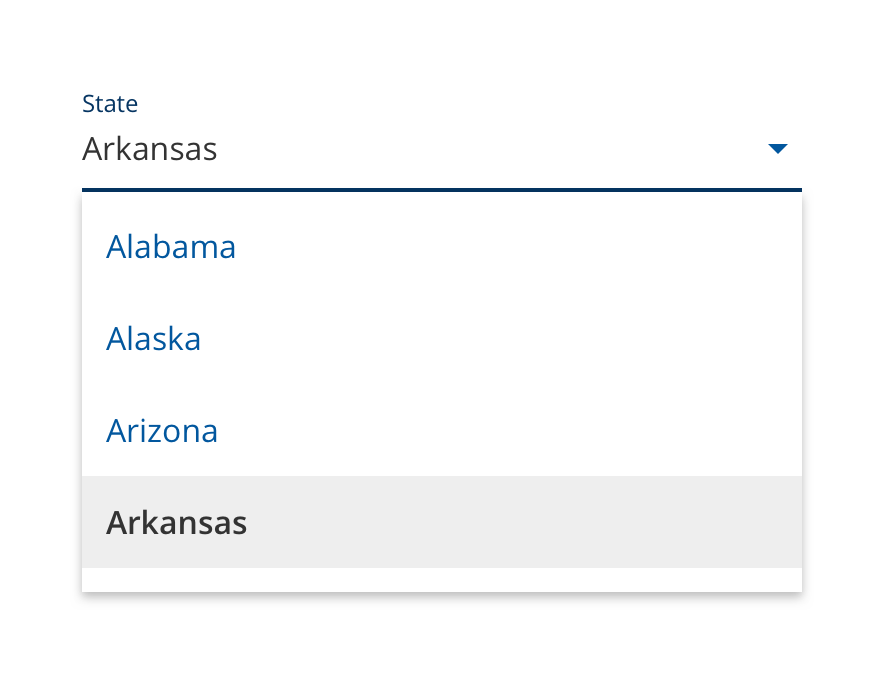
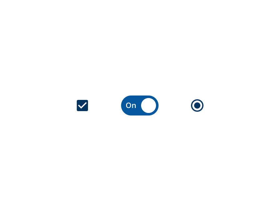
Selected
A selected state communicates a user choice.
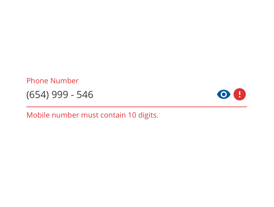
Validation
Communicates feedback to the user.
On
An on state communicates a toggle between two options.
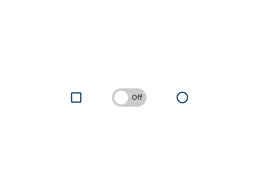
Off
An off state communicates a toggle between two options.
Material Design Interaction Resources
Material Design 2
Gestures: Gestures principles
Selection: Selection properties
States: States usage
Material Design 3
States: Interaction states