Appearance
Layout
Meaning and Message
Our layouts encourage consistency across platforms, environments, and screen sizes by using uniform elements and spacing.
They are:
- Predictable: UIs should use intuitive and predictable layouts, with consistent UI regions and spatial organization.
- Consistent: Layouts should use a consistent grid, key-lines, and padding.
- Responsive: Layouts are adaptive and react to input from the user, device, and screen elements.
Grid Layout
As we move forward in our development efforts, we are using Vuetify to build our digital products. Vuetify is a Vue UI library that provides us with the tools we need to build robust, effective, and engaging web applications using Material Design specifications.
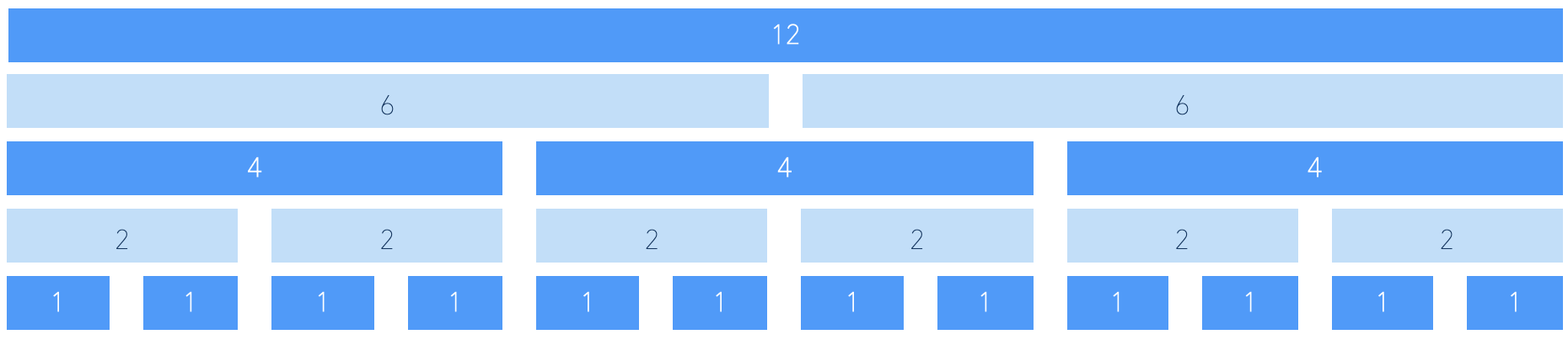
Vuetify comes with a 12 point grid system built using flex-box, which is used to create specific and consistent layouts within an application's content.
For more details of Vuetify grid system, check it out from Vuetify:
Grid Specifications
Breakpoints
This grid system contains 5 types of media breakpoints that are used for targeting specific screen sizes or orientations, xs, sm, md, lg and xl, however, we can easily change these to meet our needs.
These resolutions are defined in the Viewport Breakpoints table below and can be modified by customizing the Breakpoint service. This system allows us to control the layout depending upon the window size. That can be achieved by using specific grid props, or helper classes, that will target particular breakpoints.
Material Design Viewport Breakpoints:
| Device | Code | Types | Range | |
|---|---|---|---|---|
| Extra small | xs | small to large handset | < 600px | |
| Small | sm | small to medium tablet | 600px > < 960px | |
| Medium | md | large tablet to laptop | 960px > < 1264* | |
| Large | lg | desktop | 1264 > < 1904px* | |
| Extra large | xl | 4k and ultra-wides | > 1904px* | |
| * -16px on Desktop | ||||
Grids for Designer Use
Check out the Layout Grid from Figma's best practice: