Appearance
Accordions
Meaning and Message
Accordions are a design element that expands in place to expose some hidden information or content. Accordions expand to push the page content down in order to reveal the hidden content.
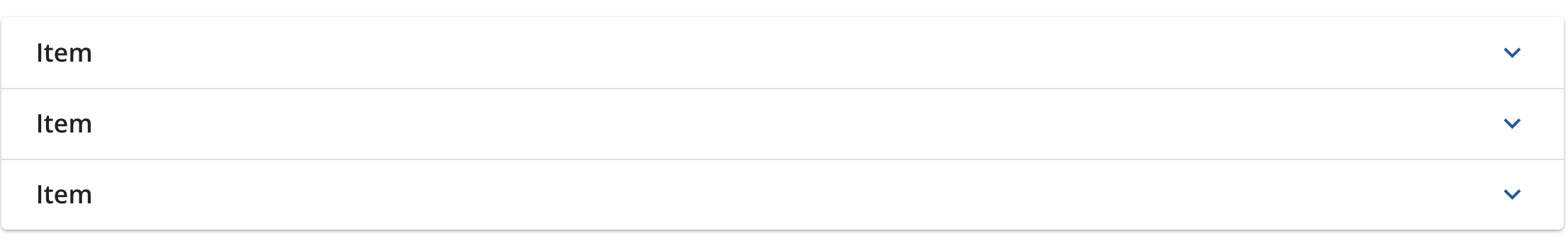
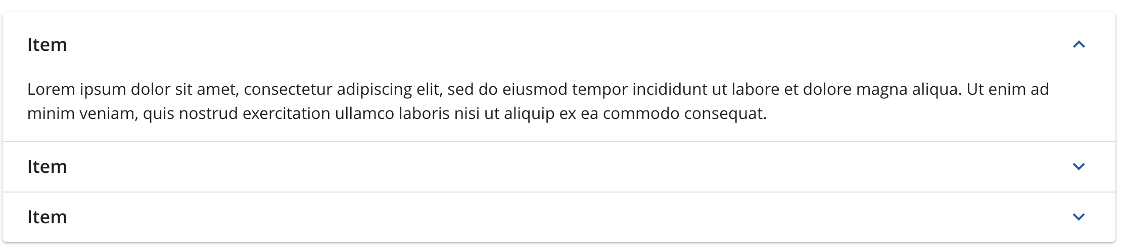
Accordion Sample
Click on the accordion component sample below to expand or collapse the items
View code snippets of Vuetify OOTB expansion-panel (accordions) component on Vuetify 3.
This is just an example of code preview block for evaluation
html
<template>
  <v-container>
    <v-row class="justify-left" id="examples">
        <v-expansion-panels variant="accordion" role="tree">
          <v-expansion-panel
            v-for="i in 3"
            :key="i"
            title="Item"
            role="treeitem"
            text="Lorem ipsum dolor sit amet, consectetur adipiscing elit, sed do eiusmod tempor incididunt ut labore et dolore magna aliqua. Ut enim ad minim veniam, quis nostrud exercitation ullamco laboris nisi ut aliquip ex ea commodo consequat."
          ></v-expansion-panel>
        </v-expansion-panels>
    </v-row>
  </v-container>
</template>css
.v-theme--light.v-expansion-panels .v-expansion-panel-title .v-expansion-panel-title__icon .v-icon {
  color: var(--v-blue700-base);
}
.v-expansion-panel:before {
  box-shadow: 0 1px 2px 0 rgba(0, 0, 0, 0.24), 0 1px 3px 0 rgba(0, 0, 0, 0.12);
}
.v-expansion-panel-title {
  font-size: 18px;
  font-weight: 600;
}Example of code preview pulled in directly from file:
vue
<template>
  <v-container>
    <v-row class="justify-left" id="examples">
        <v-expansion-panels variant="accordion" role="tree">
          <v-expansion-panel
            v-for="i in 3"
            :key="i"
            title="Item"
            role="treeitem"
            text="Lorem ipsum dolor sit amet, consectetur adipiscing elit, sed do eiusmod tempor incididunt ut labore et dolore magna aliqua. Ut enim ad minim veniam, quis nostrud exercitation ullamco laboris nisi ut aliquip ex ea commodo consequat."
          ></v-expansion-panel>
        </v-expansion-panels>
    </v-row>
  </v-container>
</template>

<style>
.v-theme--light.v-expansion-panels .v-expansion-panel-title .v-expansion-panel-title__icon .v-icon {
  color: var(--v-blue700-base);
}
.v-expansion-panel:before {
  box-shadow: 0 1px 2px 0 rgba(0, 0, 0, 0.24), 0 1px 3px 0 rgba(0, 0, 0, 0.12);
}
.v-expansion-panel-title {
  font-size: 18px;
  font-weight: 600;
}
</style>Accordion States
Accordion Minimized
Accordion Expanded
Behaviors and Guidelines
When to Use
Accordions may be used to expand or collapse additional content in page. It can also be used as a navigation element to show or hide subnav elements. Use an accordion when you have large amounts of information you need to display but need to reduce scrolling or make page less busy.
General Specifications
Material Icons and Standards
We use Material Icons for the accordion expand and collapse icon. In our Sketch component library, the icon labeled “ic_expand_more” displays by default in the minimized or collapsed state of the accordion component, and the icon labeled “ic_expand_less” displays when the item of the accordion component is expanded.


Styling
Please follow material guidelines or closest approximation within the framework being used. OneX design system should closely follow behaviors and experience across all Primerica products and make an effort to retain branding colors and style within the limits of the product framework.
Placeholder of Figma URL for styling specs of Accordion component.